The Anatomy of a Great Craft Commerce Website

By Stephen Callender
Jun 13, 2025

Tech Drop
with Stephen Callender, Foster Commerce CEO
The challenge of building smart
Without a doubt, custom ecommerce tech is complicated. If you find yourself developing ecommerce sites we can recommend building with Craft Commerce. It will serve as a great ecommerce framework on top of an amazing CMS.
But let's face it, the difficulty of building ecommerce websites is the reason lots of tech companies, like Shopify, sell one-size-fits-all solutions for some of the most common ecommerce tech challenges.
The problem is, not everyone fits off-the-shelf platforms. And not everyone wants to rent software for such a core pillar of their business.
This is where we come in. We build custom ecommerce websites for companies who don’t fit on Shopify.
But when we build custom, we're not just expected to include the unique business logic, we also need to build the basics; the features and flows that don't get listed in the client's spec sheet.
The lack of smart basics can turn a custom ecommerce build into a dud.
If you're not an ecommerce expert, the learning curve can be steep.
So, this Tech Drop series is all about unpacking the anatomy of a great Craft Commerce website by showing you three easy ways that you can make your client's Craft Commerce site just a bit smarter.
These are not complicated things. In fact, each of them is geared toward the checkout process.
Why?
Because checkout is the lowest common denominator for all of our sites — it’s something we all need to do and it's a good place for us to start and have something in common.
So let's kick this off! Are you ready?
3 ways to make a smarter Craft Commerce website
Optimized conversion
Insights and reporting
Abandoned carts email notifications
As mentioned above, this is a three-part series. Today I’m going to focus on the first of the three items in the list above, optimized conversion.
Part 1: Optimized conversion
What is optimized conversion?
Optimized conversion is all about a checkout flow that allows as many people who want to buy, to buy.
Putting together a thoughtful checkout flow is crucially important. Unfortunately, too often it's the last thing that development teams think about.
However, with nearly 70% of online shopping carts abandoned, I want to argue that we should probably consider this first in our scoping of projects.
The Baymard Institute lists 134 elements to review when improving a checkout flow. But I’m going to cover four things to keep in mind when designing and developing a checkout flow so these can guide your thinking.
In addition, I’ll show you a specific flow that, unless you have a good reason to break from it (and there are reasons to break from it for sure), I strongly encourage you to use as your base on every site.
Four things to keep in mind when designing and developing a checkout flow
1. Order matters, so provide a single path for all shoppers
The sequence of the checkout process is critical. We want to take all shoppers down a single path that has a logical sequence. But more importantly, there should be few or no forks in the road along the way.
We don't want them to have to make a decision about what do I do here? We just want them to be thinking about what they’re going to do with the awesome thing they’re about to buy.
I’ll show you in detail how we’ve constructed a checkout flow designed to do this, below.
2. Watch your click counts
The more clicks required in the checkout flow results in fewer purchases.
The average number of clicks to complete purchases in Q1 of 2018 according to Pymnts.com was 23.1. So for me, I want to beat that. Make it your goal to stay at or below the average.
Why? Because click counts convert to seconds. The highest converting checkout flows take about 140 seconds to complete. Lower-performing checkout flows take about 50 seconds longer. That's almost a whole minute, right?
Anything can happen in a whole minute to pull the shopper away!
The more we can reduce friction for shoppers and lessen the amount of time it takes to buy, the better. And so we want to move them through as quickly as possible.
Keeping clicks to a minimum will help you toward that goal. So as much as possible do things like:
Cut out unnecessary fields
Pre-populate or auto-populate fields
3. Transparent pricing matters
Shoppers are more likely to ditch their carts when they're surprised by extra costs. Excluding those who are just browsing or price-checking and not really wanting to purchase, here are the top four reasons why shoppers ditch their carts:
Extra costs are too high (shipping, taxes, fees)
The site wanted them to create an account
Too long or complicated of a checkout process
They couldn't see/calculate the order total upfront
The first and last bullet points are relevant to transparent pricing before the checkout flow. So we want to reduce surprises — especially cost surprises — and especially shipping cost surprises.
4. Increased page load speeds increase conversions
This one is really straightforward. Simply put, time is money in ecommerce!
(As a side note, if you're building a headless website, this might help page load speeds, but headless websites aren't for everyone).
If you don't take anything else away from today’s Tech Drop, if you keep these four considerations in mind they will definitely help you as you scope, design, and build an ecommerce site.
An optimized checkout flow for Craft Commerce
I want to show you this checkout flow that we've created for Craft Commerce. It’s nothing groundbreaking, but you may find it a helpful starting point when developing your own flows.
It's five steps:
Customer email
Shipping information
Delivery options
Payments
Confirmation
1. Customer email
Get the customer's email address — and I mean just the email address. In ecommerce, email is the most profitable way for merchants to reach a customer. Out of the many marketing efforts a merchant will employ, email is the best return on investment.
So, don’t allow email capture to be part of anything else in your checkout flow!
Do not:
Add unnecessary additional form fields
Ask for a shoppers email address when requesting shipping information
Make shoppers choose between checking out as a “guest” or logging in

Do:
Make the default checkout as a guest
Keep clicks down to one, maybe two clicks
Auto-focus into your first input field — this takes off one click!
2. Shipping information
Get the shipping address. At the core of this is a standard address form, which is nothing new. But since we want to be smart there are ways that we can reduce clicks in this step.
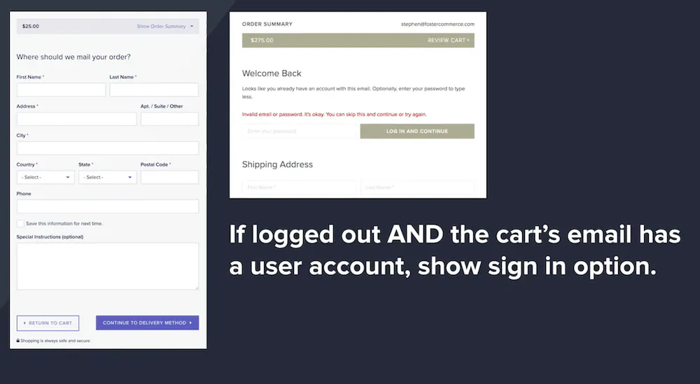
Below is what it looks like if the user is logged out and we don’t recognize the email address that they previously submitted:

So we’re checking in Craft if we recognize that email address, right? So we just give them the standard form if they're logged out and we don't know who they are.
However, if they’re logged out and the cart's email address has a Craft user account, then we can add a section above that form where they can optionally log in.
And so above this main address form, we show them something like, “Hey, welcome back! It looks like you already have an account. Enter your password to type less.”
Of course, you can use language that's appropriate for the brand you're working on. The main goal is they can log in, but it's optional — we don't want them to feel stuck.
And, it probably means fewer clicks if they have a saved address.
If they get an error message when they enter their password, add micro-copy such as, “Invalid email or password. It's okay, you can skip this step.” That way they can continue.
If they do successfully log in, we have a variable in the code to check if the cart email is in a user account, which is super simple.
However, if the user is not logged in but they have an account, the code is set to show the login form with just the password field visible.

If they successfully sign in, then the standard address form hides behind a radiolabel. Here the shopper can keep the previously saved address, or they can create a new one if needed.
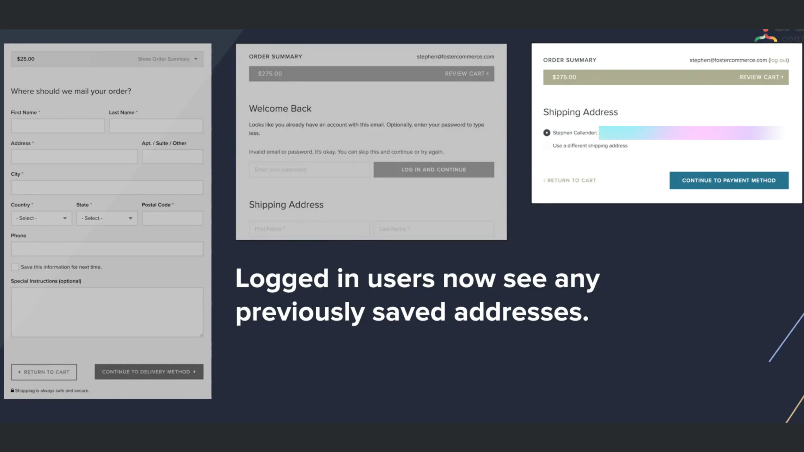
If the shopper has a primary address selected you can display that selection for them or if they just have a single address in their system you can pre-select that.
Again, we do all of this just to reduce clicks.
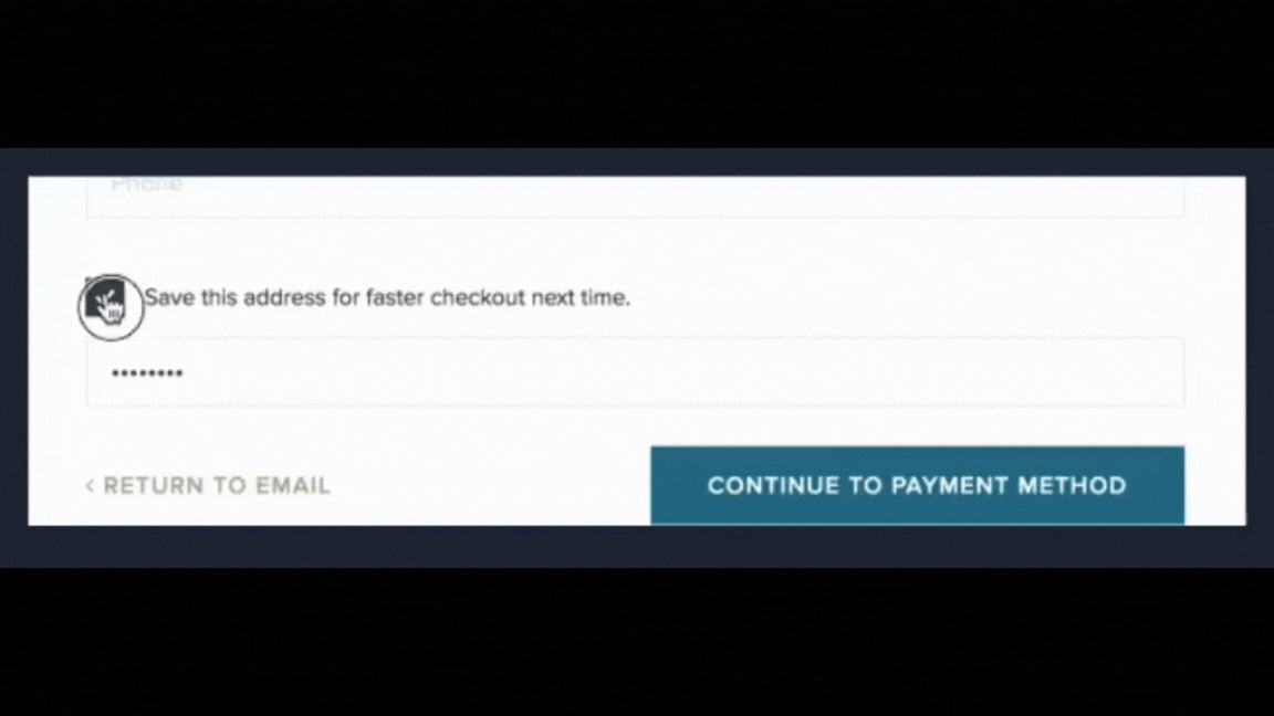
Finally, let's say that the Shopper is logged out and the cart's email does not have a user account. Then we just simply show the option via the checkbox to create an account. So that's something you can do if you want.
Do not:
Leave fields unpopulated
Ask for a shopper’s phone number when not necessary
Do:
Auto-populate forms as much as possible
Only include fields that are necessary!
At this point, total clicks should be between two to twelve.
3. Delivery options
This section is simple because Commerce does the heavy lifting for us. It shows the relevant delivery options based on the current shipping address and the cart data.
So, if your store has more than one shipping method then we want to show this.
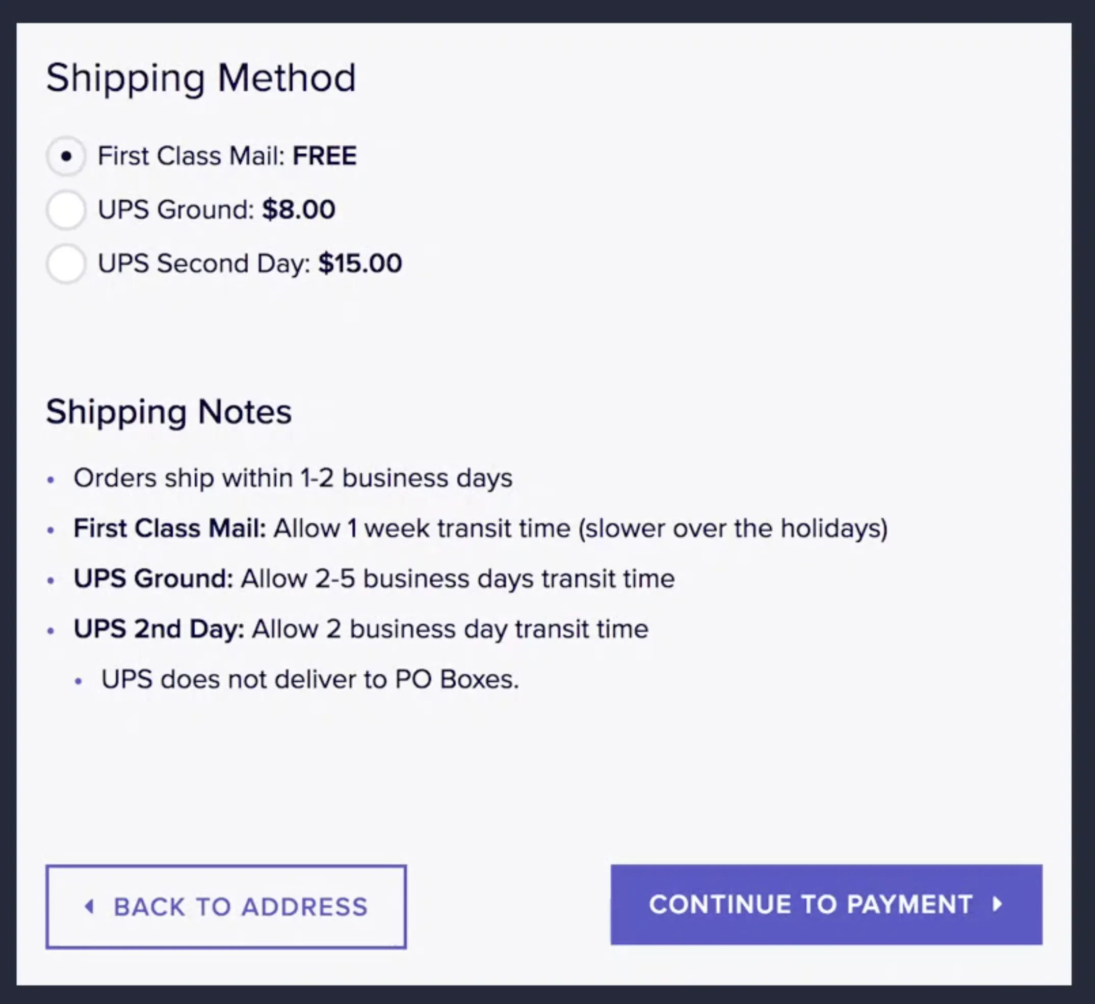
However, if you only have one shipping method for the entire store and for all of your customers, then you can skip this step. Instead, you can just include these values somewhere else in the checkout process beforehand.
Remember, one of the top reasons that shoppers bail during the checkout process is because of this page — and surprise extra costs.
To eliminate the surprise, make sure that the content on this page is nothing new. It should just be what they expect to see, or a chance to modify a previously selected shipping method.
Now, I will acknowledge that what I just described is easy if you have flat shipping rates. If you have shipping rates that change based on the shipping address it’s a little more complicated.
But you can develop a module or plugin estimator, or use someone else’s, to provide shoppers with the information they need to at least estimate shipping costs.
4. Payment
Again, there's nothing fancy here. What we want to show at this point is the payment options and that's it.
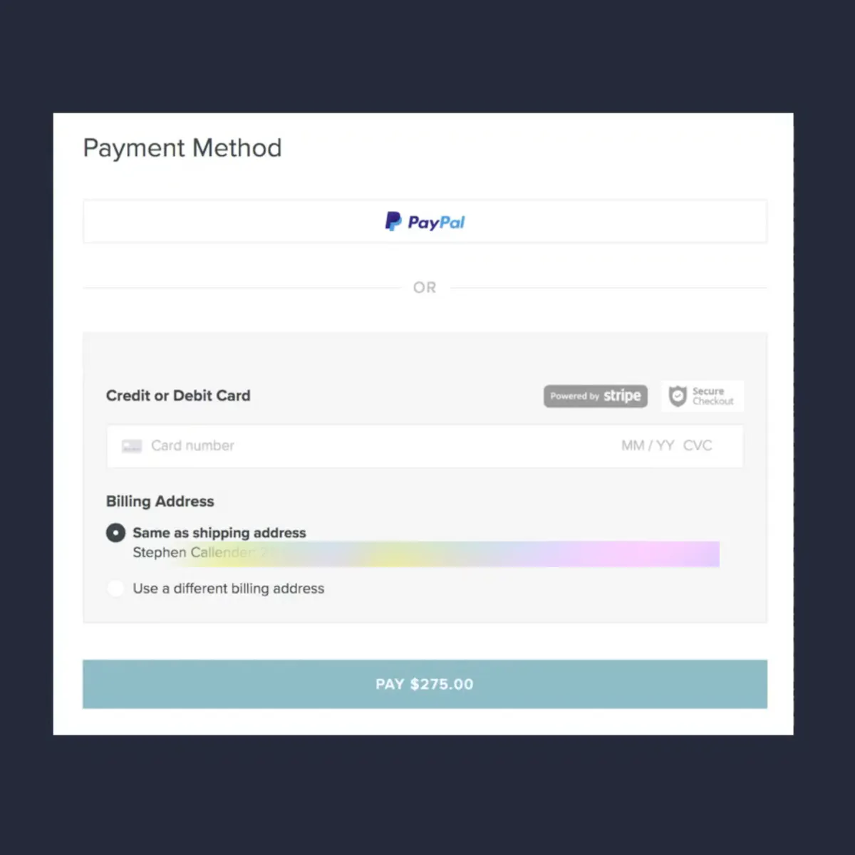
But I want to share a few helpful UI tips.
Do:
Display off-site payment options first
If you have PayPal, Amazon Pay or Google Pay, or any other “pay” other than a credit card, show shoppers those options first at this point in the checkout flow.
We don't want shoppers needlessly filling out credit card fields when they’d prefer to use something easier. But also, we want to keep that single path for all shoppers. To do that, we want Craft Commerce to gather all the order details and costs before redirecting shoppers to a third-party gateway.
Display a security badge
I think we all know that security badges on sites don't really mean anything, but they do matter tremendously to shoppers.
So tell them that the site is secure with a badge if you can say honestly that your site is secure. And it goes without saying: if your site's not secure don't add a badge indicating that it is (and then maybe stop building e-commerce sites!).
Put your payment amount on the button
Again to add confirmation and reduce surprises, it helps to let shoppers know how much they're paying.
Do not:
Add a checkbox asking if the billing address is the same as the shipping address
In Craft, you don't have to do that. Instead, just label your shipping address, and if they want to use a different one they can.
Ask for the shopper’s name when asking for their credit card information
Names are attached to the billing address in Craft and should automatically display. However, if you do need to have the name field for some reason make sure it's below the credit card number.
Bonus:
Stripe is clearly the developer's choice. However, if you can’t use Stripe because your client doesn’t want to, that’s understandable.
But there are a few lessons we can use from Stripe and their UI, that I think are worth noting. If you can do these things, great!
Validation of credit cards to reduce errors
Localization so the zip or postal code changes depending on what country the credit card is attached to
Formatting and masking of credit card numbers
At this point, total minimum clicks is 9. That’s if the shopper starts with a logged-out status. If the shopper is logged in, it would be less. The total maximum clicks are 27, (if no errors).
Remember, the average maximum click count is 23.1, so we’re doing well!
5. Confirmation
This step often gets overlooked but the content at this step is actually very important! Why? Because when confirming the purchase merchants have an opportunity to build brand awareness and connect with their customers.
A few examples of messaging are things like:
Share your purchase with friends
Buy more now and save
While you wait here’s what we’re doing! (see this fun example from Peel)
Summary
So there you have it! Each step of a checkout flow — email, shipping information, delivery options, payment, and confirmation is each very doable.
It's just a matter of keeping the four considerations in mind during the process:
Order matters. Provide a single path for all shoppers
Watch your click counts. Keep it down.
Transparent pricing matters. No hidden fees.
Page speed matters.
So keep these in mind when you build your next ecommerce site.
And contact us if you get in a bind! We’re here to help you out.
This Tech Drop is taken from Stephen Callender’s 2018 Dot All talk, Building a Smarter Craft Commerce Website.