Say hello to container queries in CSS

By Engineering Team
Jul 17, 2023

Tech Drop
with Michael Van Dorth, Senior Engineer
You’ve probably heard the happy news that a second way of influencing layout changes now exists.
Recently, container queries have become available in all mainstream browsers, which greatly simplifies the process of making components adapt to where they are being used in the layout.
This is something to celebrate!
If you’re like me, you’ve been patiently waiting (ok, maybe pleading) for an alternative to the cumbersome process of using CSS media queries to modify a component's layout.
I cringe just thinking about the many times I’ve made a component look perfect at a specific breakpoint in one area (for example, the main content area) only to find that it didn’t look so good in a smaller space (say in a sidebar area).
Of course, this common problem requires that developers add special classes or modifiers (ex. “.card” and “.card–sidebar”) and the additional CSS to override those media query breakpoints.
Needless to say, this is a lot of extra work.
But rather than having to create components that adapt to screen size using CSS media queries, now developers can make modules that adapt to their own defined, available space.
With this latest development, we can develop and modify designs with a lot more ease. And we’re finally free to create UI pattern libraries without all the hacks, workarounds, and repeated code.
How do CSS container queries work?
CSS container queries work a bit like traditional media queries. However, instead of relying on the screen size for breakpoints, you specify a “parent” or global wrapping element as the context of the breakpoint rules.
Keep in mind that you won't be able to change styles on the container element itself based on queries. Instead, you will only be able to change styles on child elements of the container. (That’s why in the example I show below we will apply it to the top-level element in the component — the “.card” element).
In general, CSS container queries create truly independent visual components that adapt and change according to the space they have available.
That’s because, with container queries, you only have to concentrate on how the component's layout changes based on the space they have, and not on the overall screen size.
This allows you to reduce complexity in your CSS and also makes it a breeze to reuse components throughout a large project.
Container queries also impact the creation and usage of a UI pattern library. In creating the pattern library, you don't have to create multiple variations of a component that may need to exist if they are used in different places (influenced by their parent container).
This means you have a lot less code to write.
And in the usage of the pattern library, you don’t have to select a specific variation of a component to use for a specific location. That’s because the component is "self-aware" of the space it has, and modifies itself accordingly.
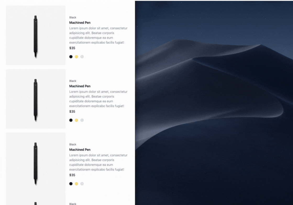
Example of an adaptable card element
Here’s an example of a ‘card’ element that adapts its layout depending on how much room it has.
The first step is to assign a top-level element of the component as a “container”, based on the type of container it should be. We assign the type of container it is using CSS logical properties and values. In this case, “inline-size” for horizontal queries, “block-size” for vertical queries, or “size” for both.
You can also assign the container a name, which makes it easier to reference when you are specifying the queries or breakpoints on the cards' child elements.
Now you can add your container query rules/breakpoints to the child elements, using the same width identifiers as you do with media queries but remember, these will now be based on the element we assigned as a container, and not the screen size.
Block-size container types
In the examples above I illustrated the “inline-size” container type, which is based on the width of the container element. However, you can also use the “block-size” container type to base your container queries on the height of the container element.
As UI developers we know that vertical height is always unpredictable due to unknown and variable amounts of content. But with “block-size” or vertical containers, you can start to have more control over the vertical layout.
For example, say you have a card with a content area. It may look good at a certain height that the designer imagined it. However, once the actual content starts to come in it may start to get too tall in some cases.
At this point, you could apply a “block-size” container type and change styles based on the amount of content the element contains:
Creating responsive size types within a component
Another neat thing with container queries is that you can use container query length units on the child elements within the container. That is, units that are based on the container's current size.
cqw: 1% of a query container's width
cqh: 1% of a query container's height
cqi: 1% of a query container's inline size
cqb: 1% of a query container's block size
cqmin: The smaller value of either cqi or cqb
cqmax: The larger value of either cqi or cqb
This is a pretty interesting way of, for example, creating responsive type sizes within a component:
There you have it!
Try it out and let me know what you think. Does it make your job as a developer easier? Send me a note on Twitter and let me know — I’d love to hear your thoughts.